Veridapt
Veridapt is a global provider of commodity monitoring and management solutions, operating in a highly technical, data-heavy environment. Their platform supports complex workflows across logistics, tracking, compliance, and reporting. Web Force 5 partnered with Veridapt to redesign their digital experience, improving clarity, usability, and positioning within a competitive enterprise landscape.

Challenge
The existing website was dense, difficult to navigate, and did not clearly communicate the value of Veridapt’s offering.
Key issues included:
-
Complex product structures that were hard to interpret
-
Limited visual hierarchy, making key messages easy to miss
-
A lack of clear pathways for different user types
-
An outdated interface that didn’t reflect the sophistication of the platform
At a business level, the site wasn’t doing its job. It wasn’t supporting sales conversations, and it wasn’t reinforcing credibility at an enterprise level.

Research and alignment
We worked closely with stakeholders to understand the platform, user types, and commercial priorities. The goal was to translate a highly technical product into something intuitive and accessible.

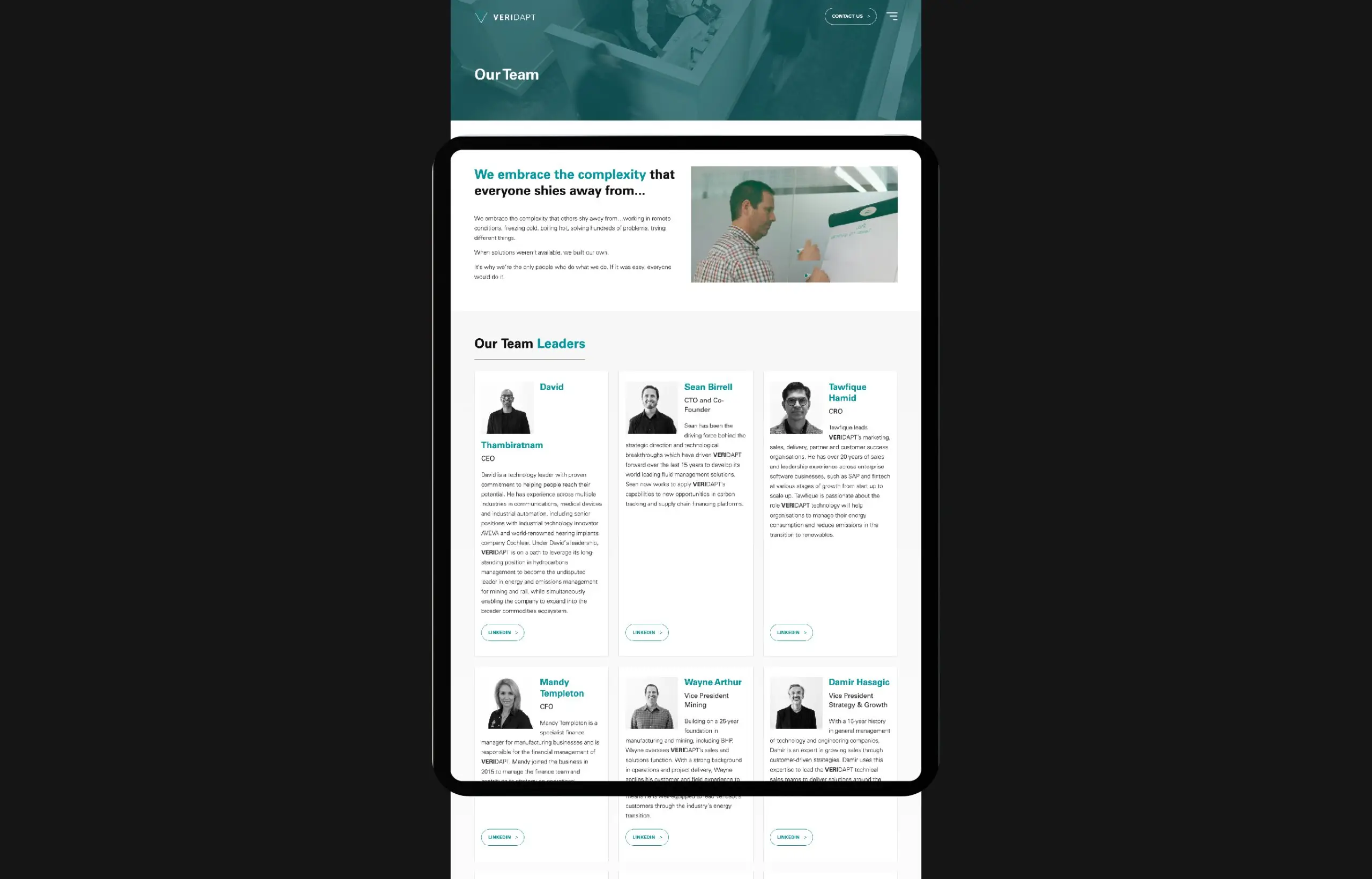
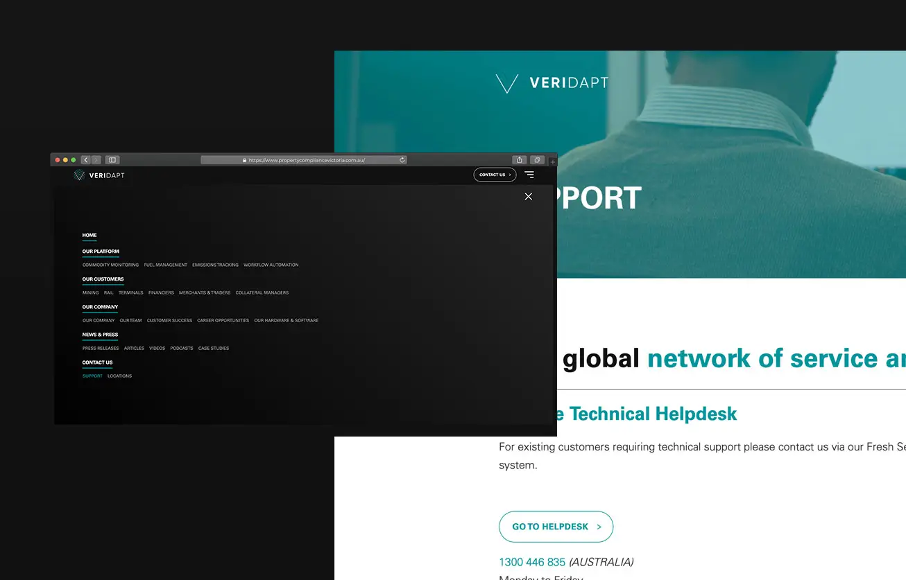
Information architecture and UX strategy
We restructured the site to clarify product groupings and relationships, introduce logical user journeys, and reduce cognitive load across key pages.

Wireframing and interaction design
Low-fidelity wireframes allowed us to validate structure early, ensuring navigation and content flow worked before moving into design.

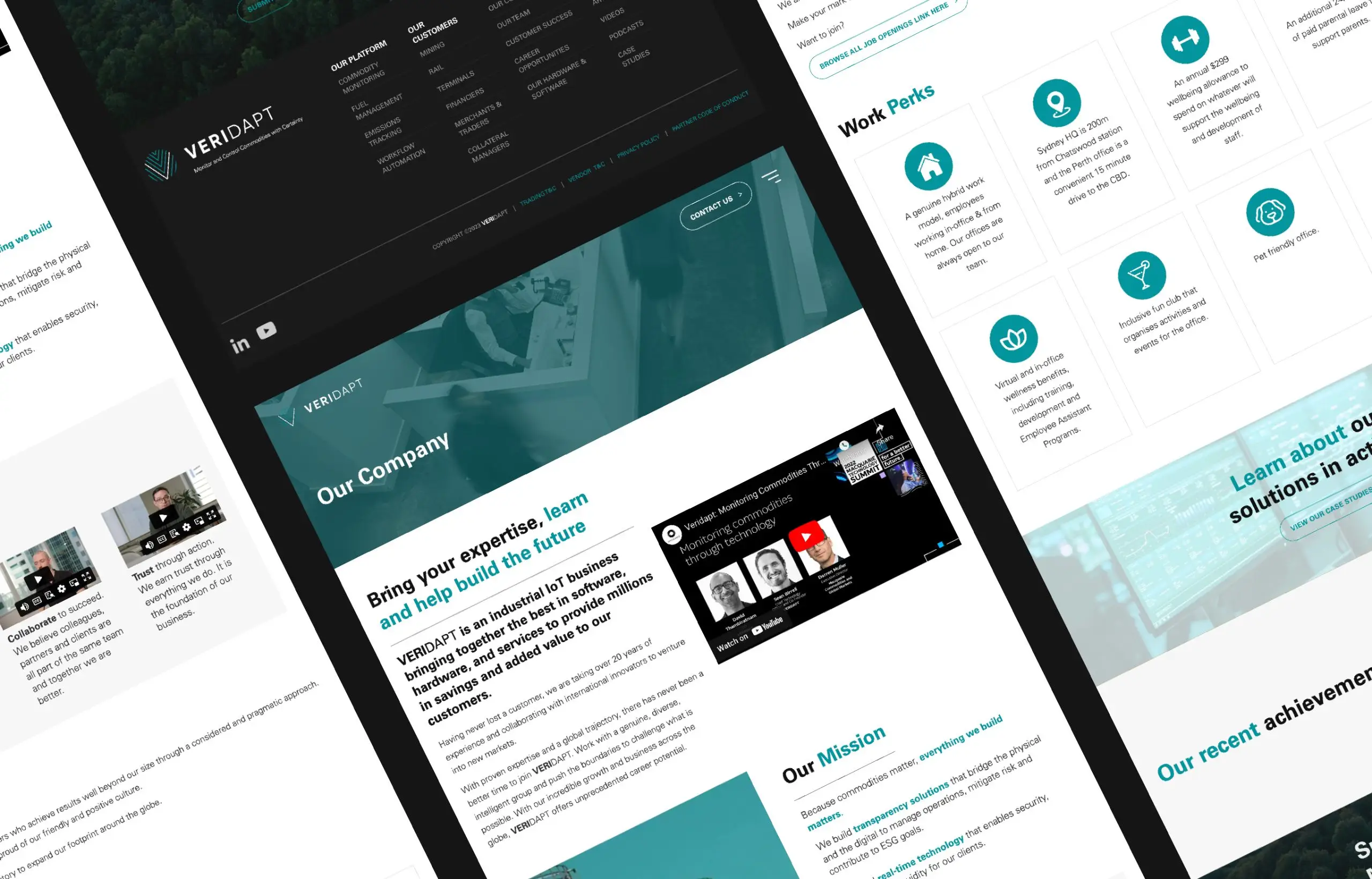
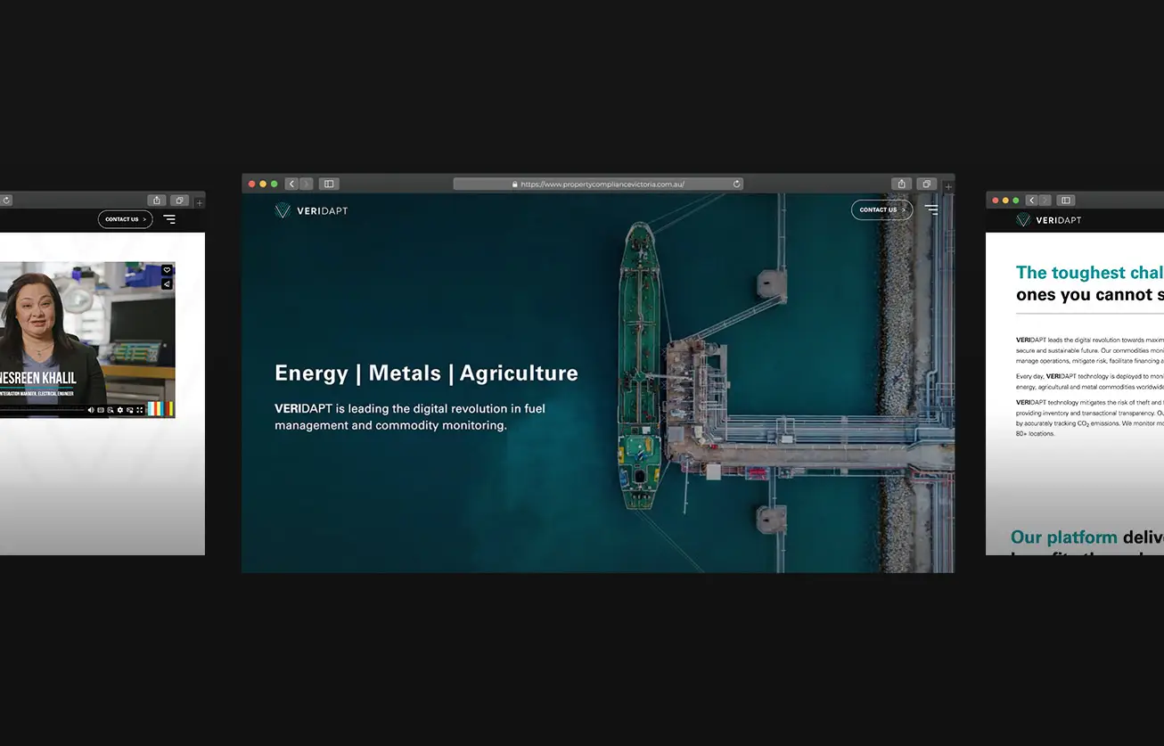
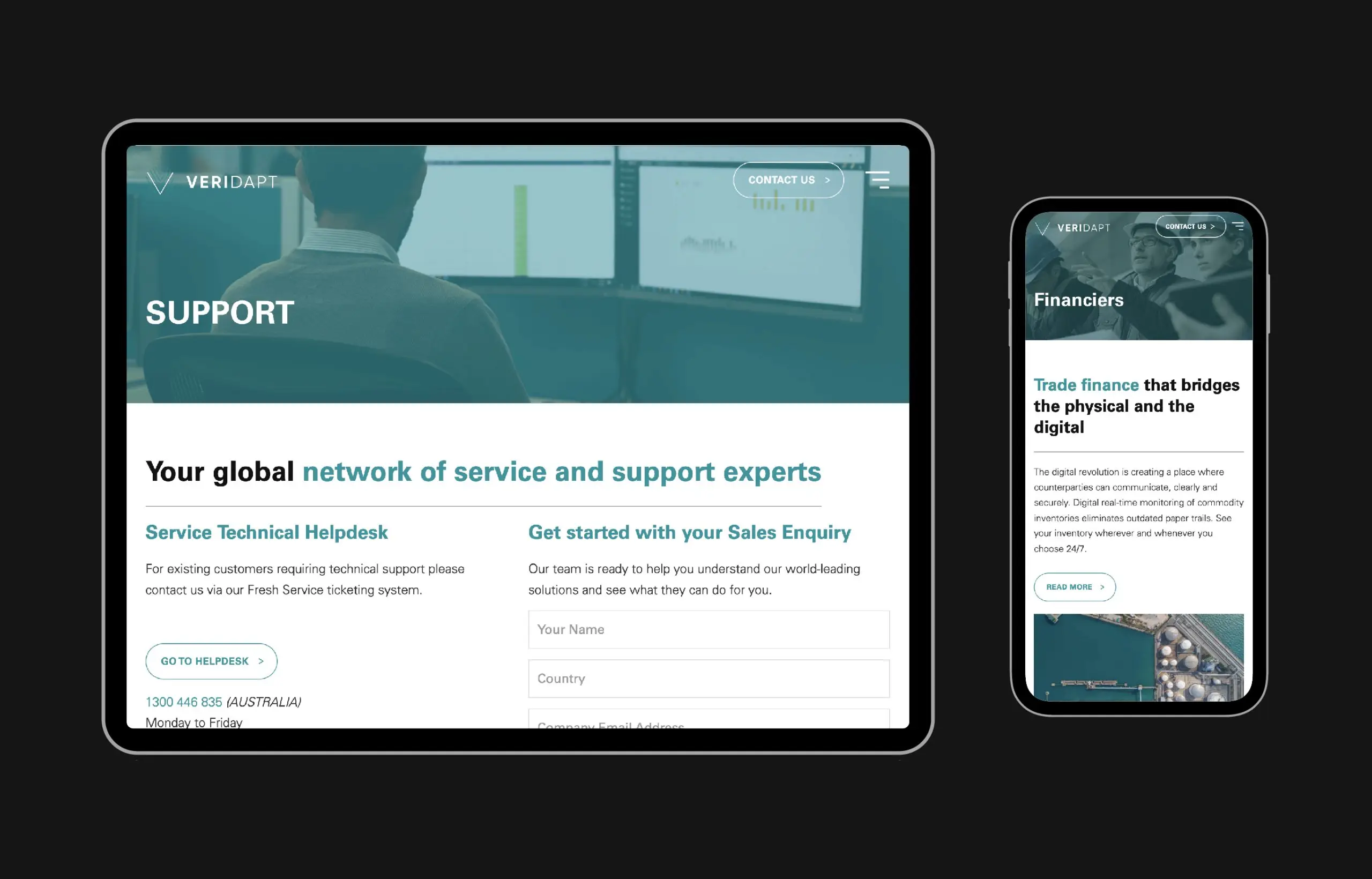
Visual design and brand alignment
We introduced a clean, modern interface with strong hierarchy and consistent UI patterns. The design balances enterprise credibility with usability, avoiding unnecessary visual noise.

Integration and development
The site was built with scalable components, integrating tools such as Google Analytics for performance tracking and Jira for ongoing workflow and iteration.

Testing and refinement
We validated key interactions and ensured consistency across devices, with a focus on real-world usability for enterprise users.
Outcome
The final outcome is a streamlined, scalable website that:
- Clearly communicates Veridapt’s product offering
- Supports multiple user journeys without confusion
- Simplifies complex information through structure and hierarchy
- Aligns with enterprise expectations in both design and performance
The platform now acts as a proper commercial tool, not just a static marketing site.


Results
- Improved clarity and engagement through simplified navigation and stronger content structure
- More effective product storytelling, supporting sales and onboarding conversations
- Stronger brand positioning within the commodity monitoring space
- Scalable foundation for future growth, updates, and product expansion
Conclusion
This project is a good example of what happens when design is treated as a business tool, not decoration.
By focusing on structure, usability, and alignment with commercial goals, we transformed Veridapt’s digital presence into something that actually supports how the business operates and grows.